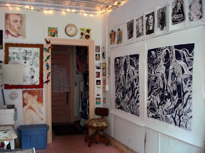


Yesterday afternoon I pulled 2 more proofs of the right side of my linoleum print diptych. I have to do a bit more carving on this plate. I will also be doing more carving on the left panel today.
I mixed a midnight blue ink for these, and hand printed them. Actually, hands, feet, knees - I even sat on them and scooted around - whatever could give the best pressure - quite the sight, I'm sure!
I need to resolve the left side of this print. Suggestions? Feedback? Everyone is always complimentary on these blogs - how about some constructive criticism? I'd get it at school, you can be certain of that! Is it too busy now?? When it is put through the press the solid areas will be very opaque and darker than these hand pulled proofs...
But I think that there is enough info here for you all to see what's going on. I'm thinking that perhaps I need some solid white areas on the left between the branches? (on the right these areas are all hatched...) or do I continue with that hatching on the left, too? Or will this make the composition too square and evened off? Or, I was thinking of making more of the floral patterns (like the ones on her skirt) between the branches...
Or, do I make the branches white on that side? Or do I carve that whole damn side out, so it's white, with no imagery?
Ok, I'm looking at it again, and thinking that side needs to stay dark...
Oh, and I want to make her nude from the waist up - I think that this would be benign enough to put in the Walker Terrace window, so this means I must carve nipples! But then, the guy I'm carving has on a robe...I was thinking of making his chest show through the robe - so that they are both partly clothed and partly unclothed, but clothed in the nature that is all around them... that old Garden of Eden thing again...
Help! Sock it to me! I need a crit.


2 comments:
Hi Martha--very nice hand, feet, knees and butt prints! Maybe lighten up the area behind the bird and the flower on the left side of her head--making the bird and flower stand out because they're dark, but leaving it dark around her hair. Maybe lighten the tree branches (on the left of the print), but lighten in terms of depth, like the closest being the lightest an the ones further back a bit darker--leaving some of the branches dark along with the background? I'm confident you will figure this out--it's beautiful as it is!
Yes! Good ideas! Thanks!!!
Post a Comment